Bespoke Branding for a Jewellery Designer: Bold, Fiery and Art Nouveau Inspired
“the fire and passion you need to create”
BUSINESS NEEDS
With her business steadily growing, Nadine felt it was the right time to refresh her logo and invest in a bespoke brand identity that truly reflected the business’s values — and, just as importantly, its personality.
With a range of new brand assets on the horizon, it made sense to invest early so that everything from packaging and thank you cards to display units could feel consistent, authentic, and confidently rolled out across the brand.
DELIVERABLES
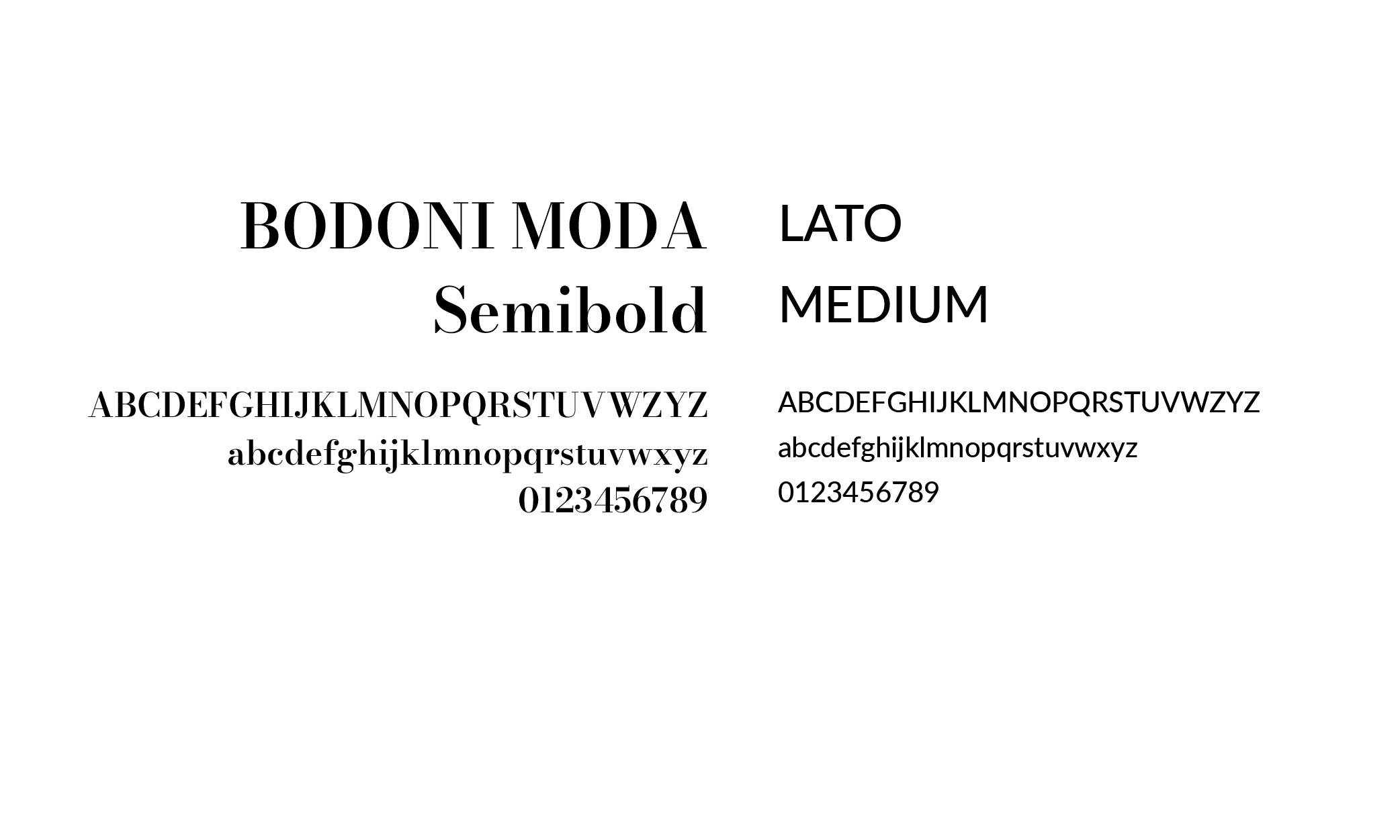
Research and Concept Development
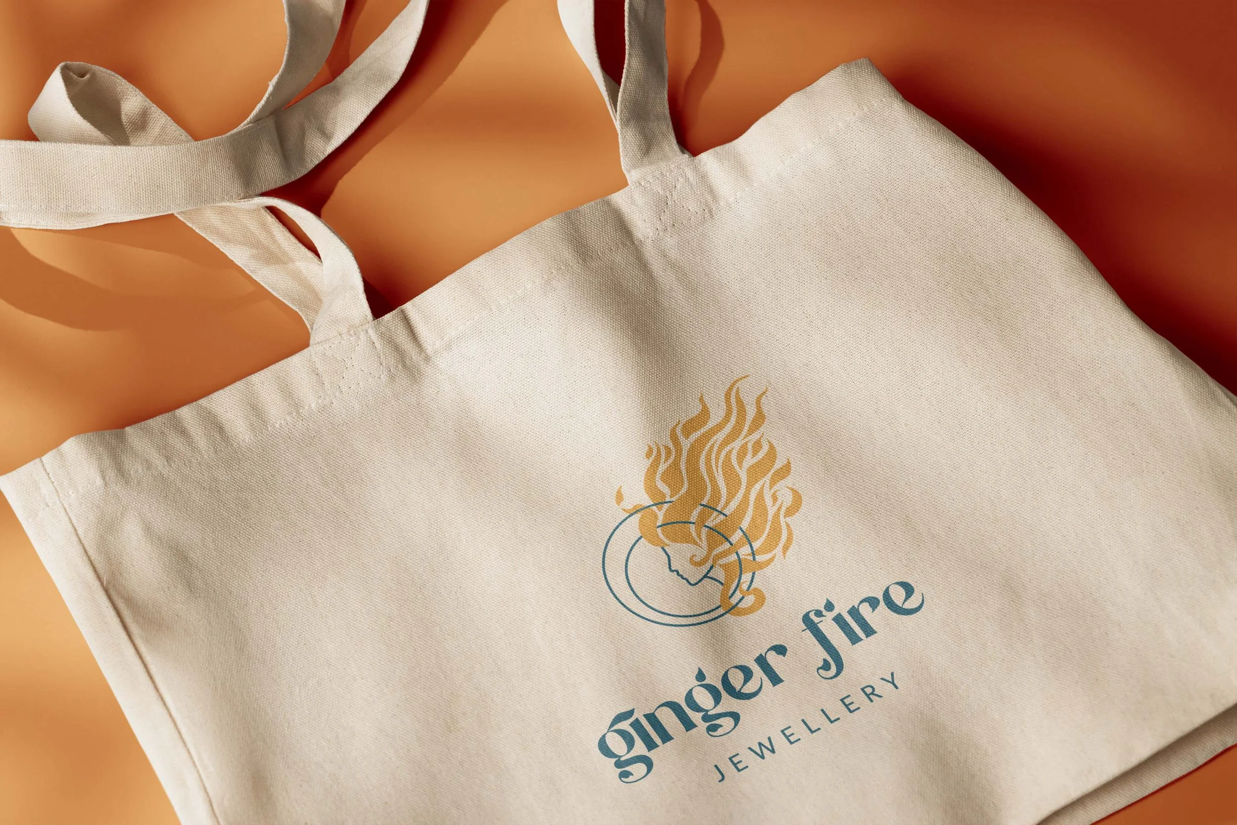
Primary Logo Design
Secondary Logo Designs
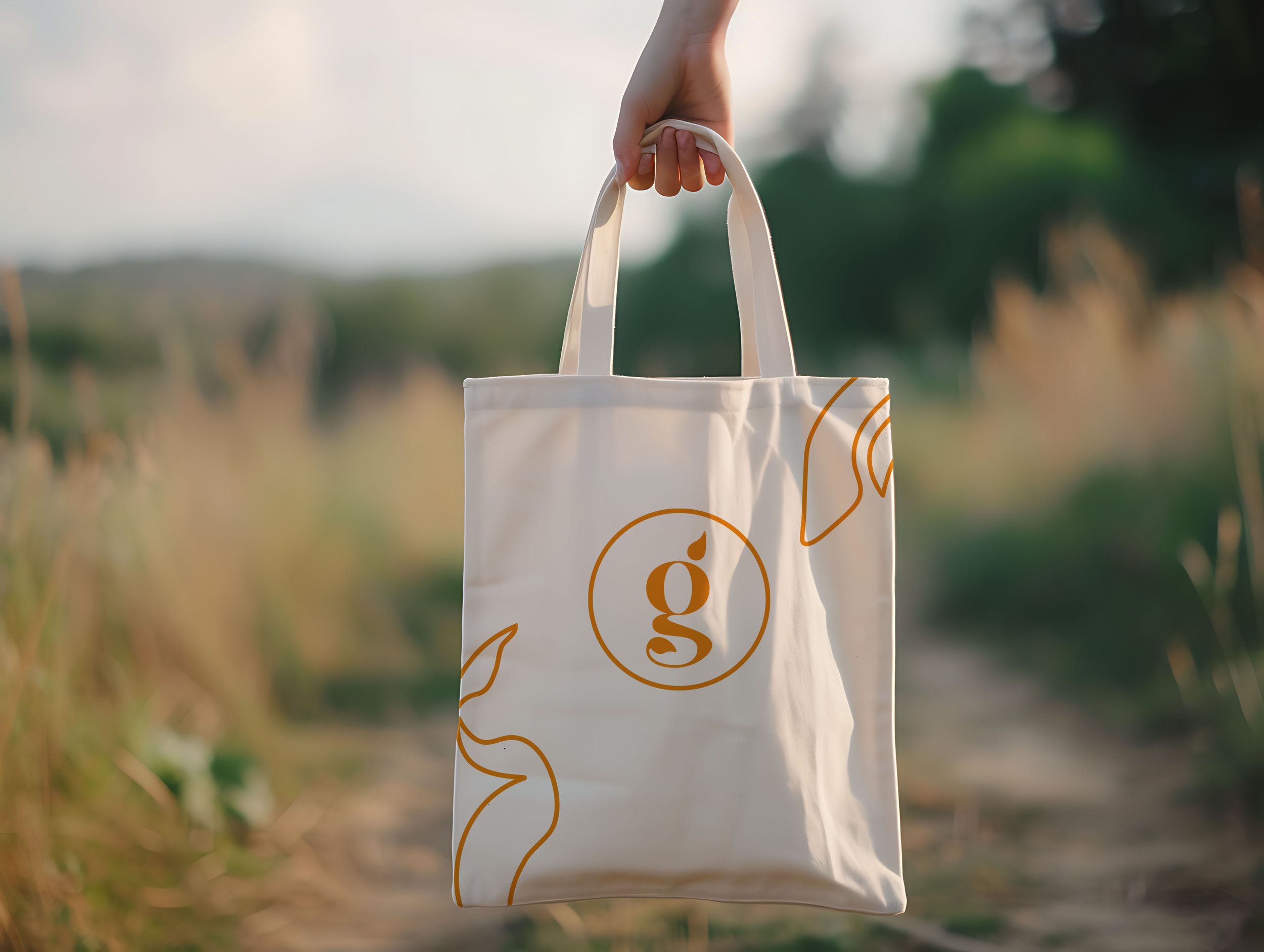
Logo Symbol
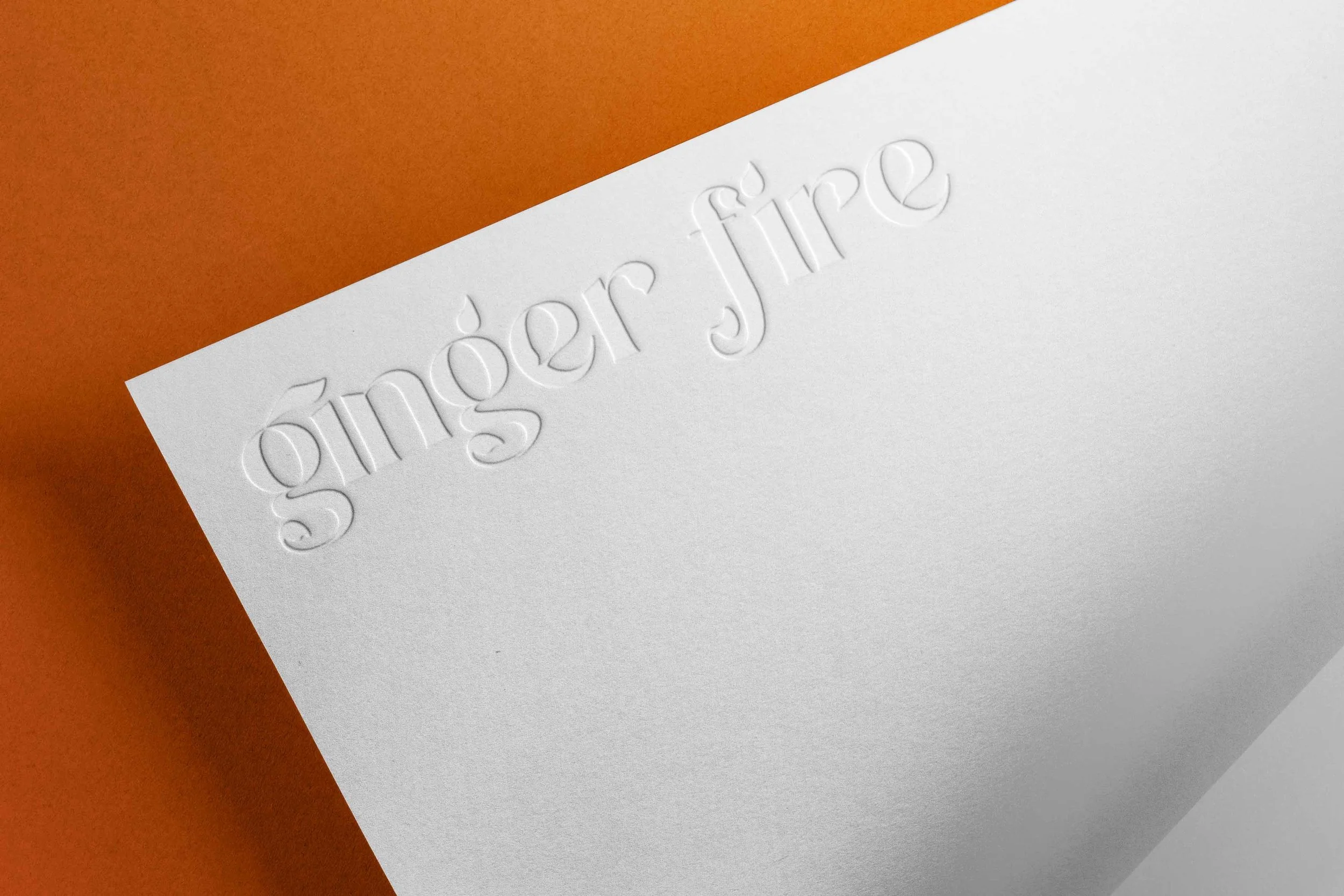
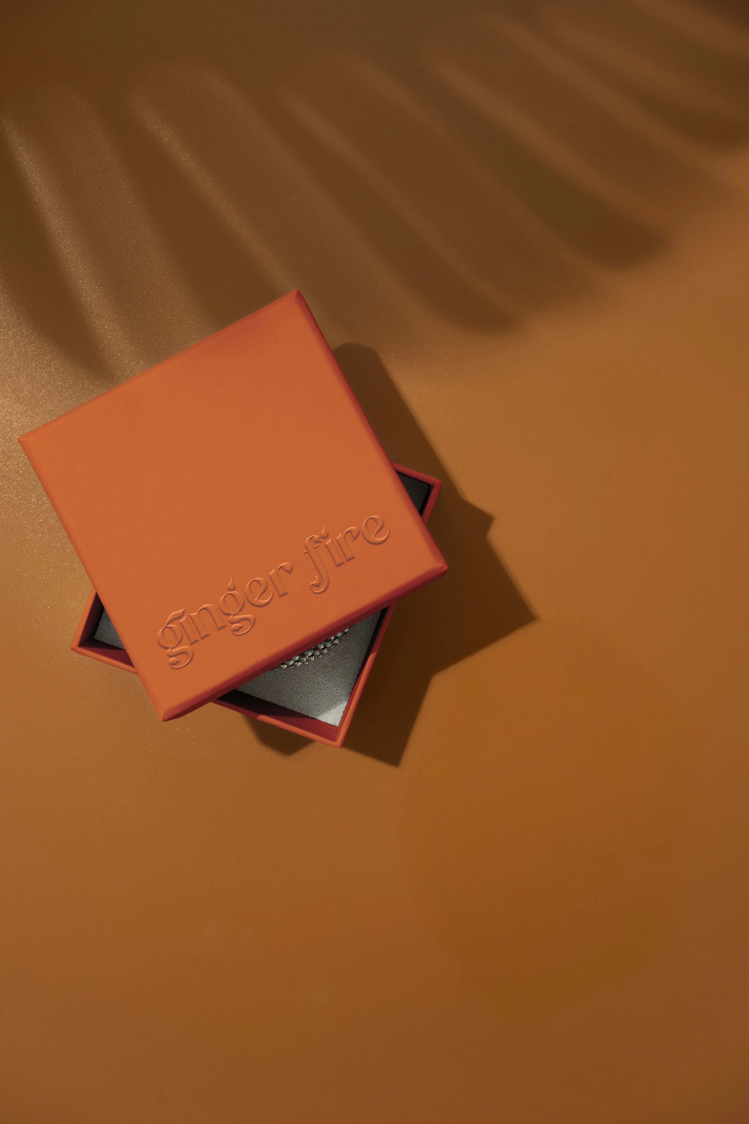
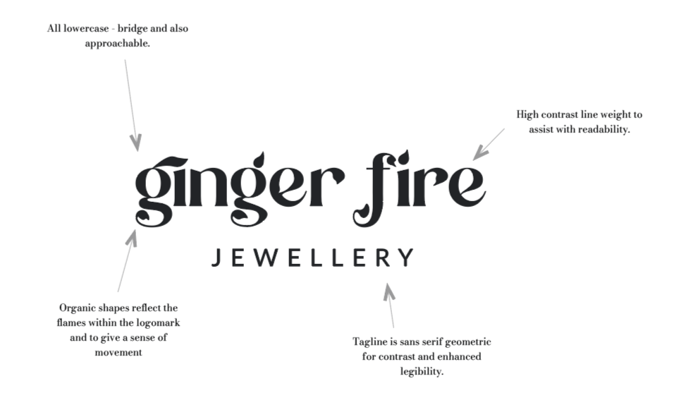
Bespoke Wordmark
Additional Responsive Logomarks (for small scale use)
Logo Family Production (for print and screen use, full colour, white, black versions in various formats eg .ai, png etc)
Bespoke Iconography
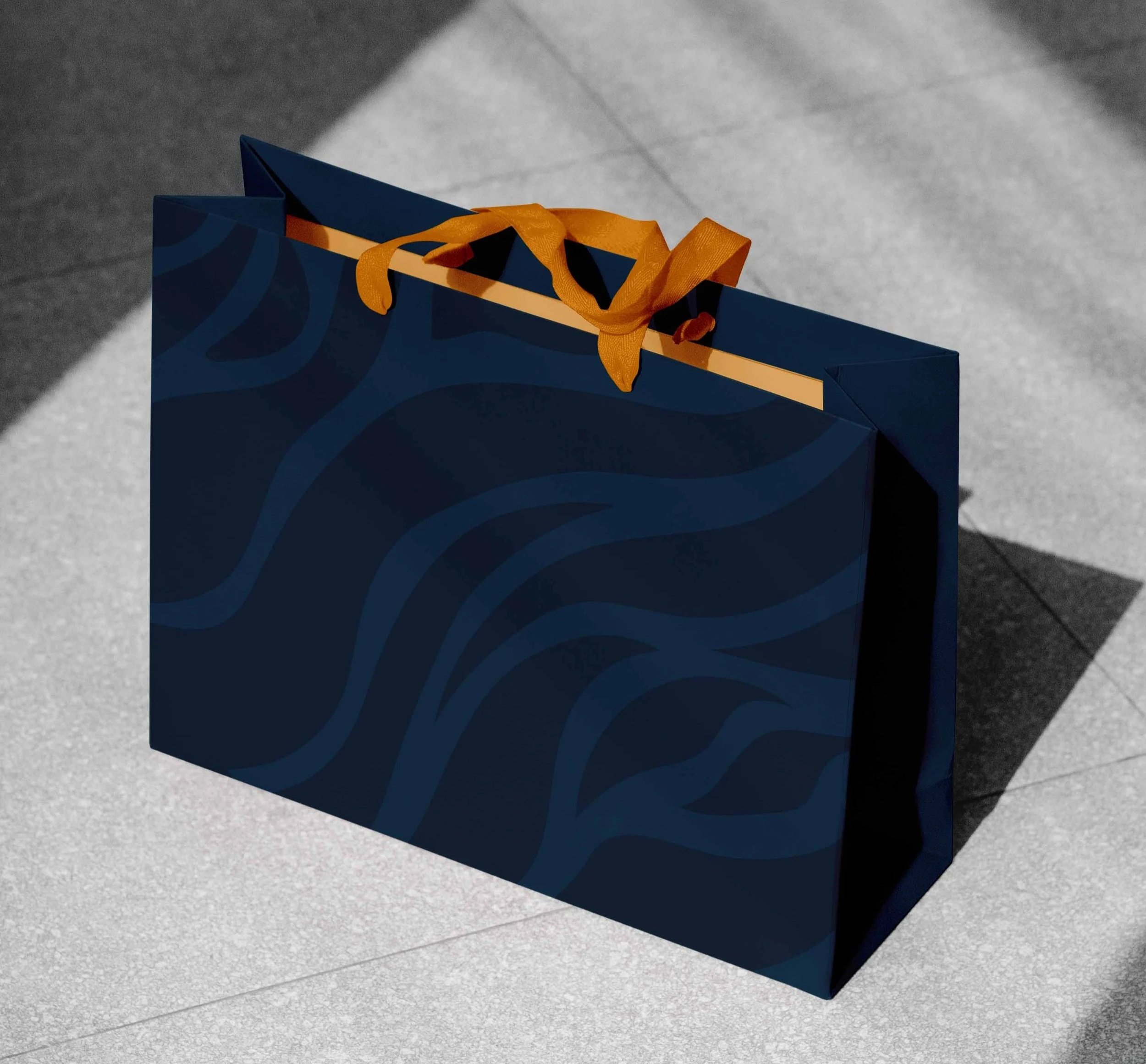
Bespoke Pattern and Element Designs
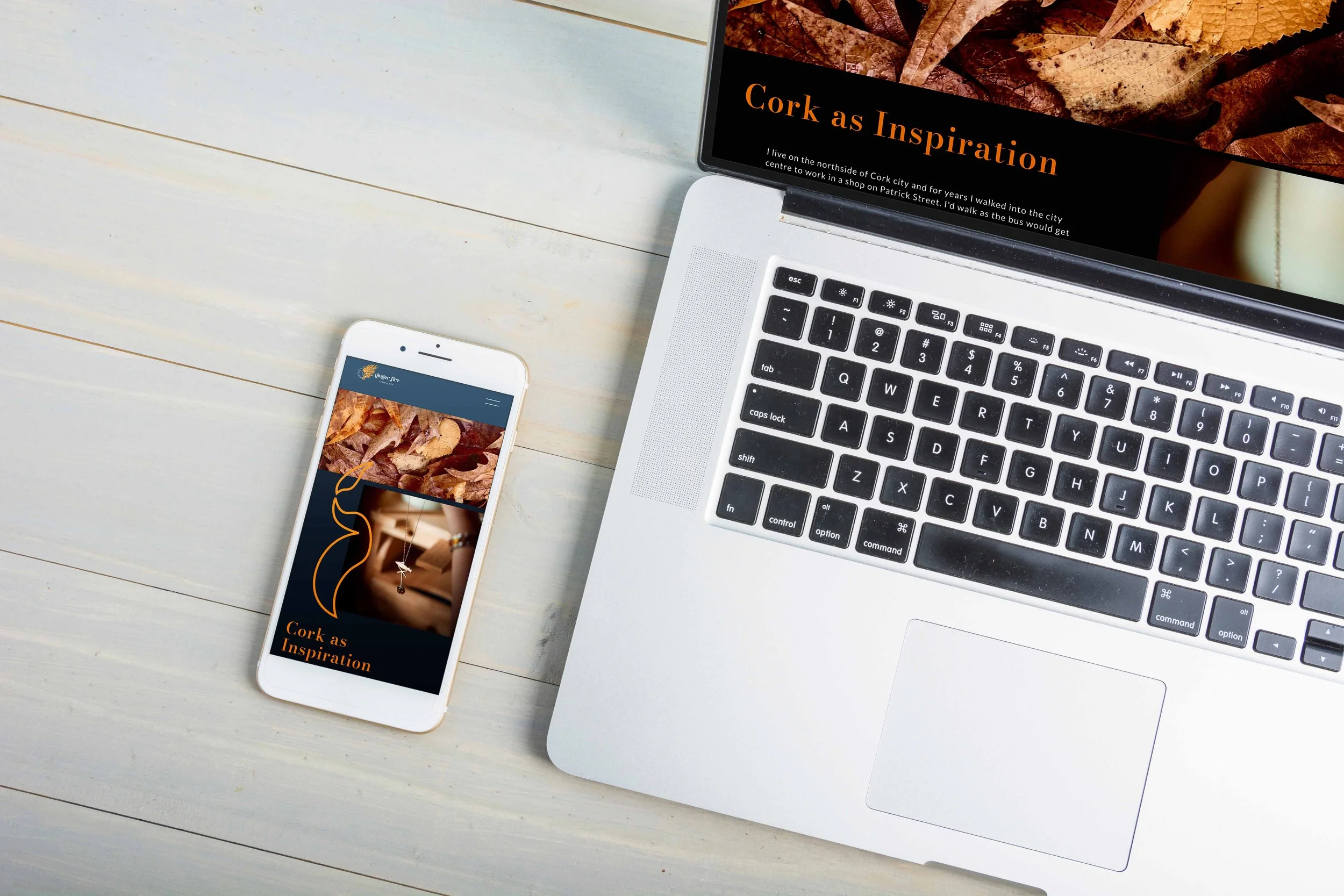
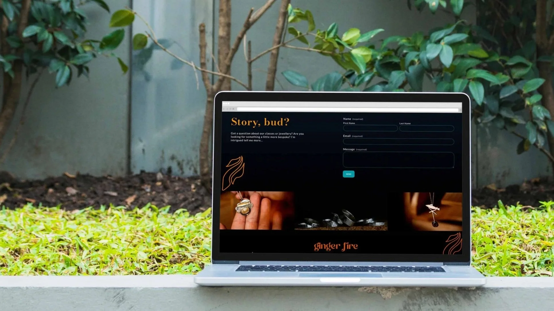
Website Design and Development (Squarespace)
Thank You Card Design
Business Card Design
Animation by: Dee
PROJECT RESULTS
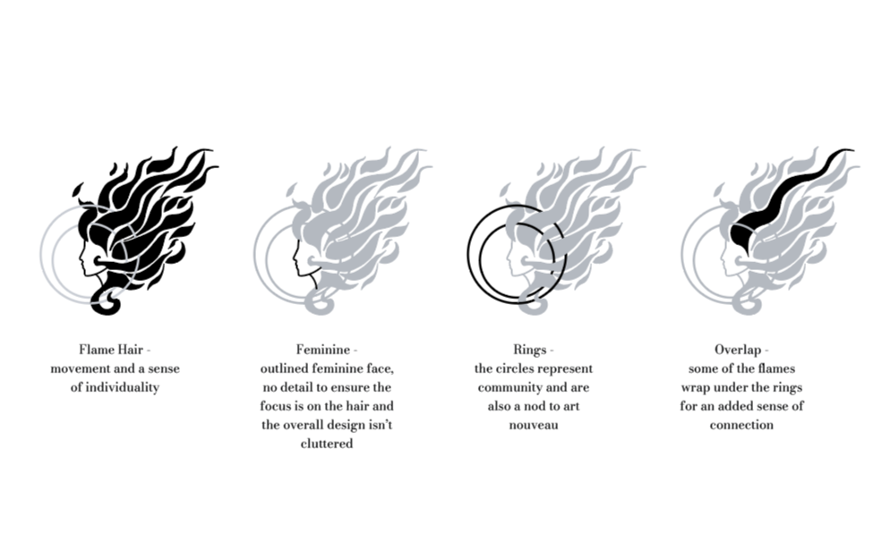
With a focus on the goddess/warrior archetype, we developed an Art Nouveau–inspired female figure with untamed, fiery hair. This serves as a subtle nod to Nadine — the jewellery designer, creator, and tutor behind the brand — while also symbolising the spark, energy, and passion from which creativity is born.
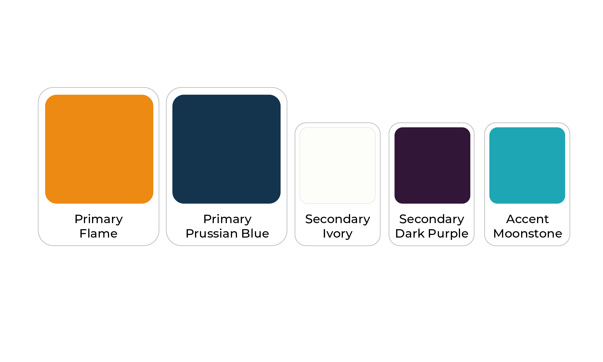
The palette is built around a confident, energetic contrast, led by a bold primary orange. This shade feels lively, fun, and dynamic — a rich golden-orange that naturally draws attention without feeling overpowering or harsh.
Supporting it is a deep blue secondary primary. Leaning toward navy, it brings a sense of reliability, authority, and professionalism, grounding the vibrancy of the orange with a more refined, no-nonsense tone.
The accent colour, a fresh cyan, bridges the two. It softens the transition between the warmth of the orange and the depth of the navy, adding brightness and clarity while keeping the overall palette balanced, modern, and approachable.
WHAT THE CLIENT SAID
“… holy shit, yes…”
If your logo and brand identity no longer aligns with your business values – we can help!
We create branding solutions and provide support to help your business overcome visuals that don’t reflect your brand and may be hindering its growth.
We will help you achieve unique branding that emotionally connects both inside and outside your organisation, ensuring long-term success through personalised and collaborative specialist support.
We promise to provide you with the visual tools to grow your brand with confidence.