Inclusive Language & Logo That Puts People First
“community-focused, bridging the gaps, welcoming, accessible and approachable…”
BUSINESS NEEDS
Inklusive originally focused on helping large organisations reduce exclusion and build a stronger sense of belonging through inclusive language audits, edits and education. Over time, a shift was felt and while this work was still values-led, it was often treated as a DEI box-ticking exercise within corporate environments.
While the work itself remains important, the business wanted to move towards the more meaningful side of the impact — shifting focus to community-based and education-led work, with a much less corporate tone.
The existing branding no longer reflected the values or direction of the business. A new logo and identity were needed to mark this shift, better communicate its purpose, and — most importantly — celebrate the human focus at the heart of the work going forward.
DELIVERABLES
Research and Concept Development
Primary Logo Design
Secondary Logo Designs
Logo Symbol
Logo Family Production (cmyk, rgb, white, black in various formats e.g. .ai, .png etc)
Pattern Design
Brand Style Guide
PROJECT RESULTS
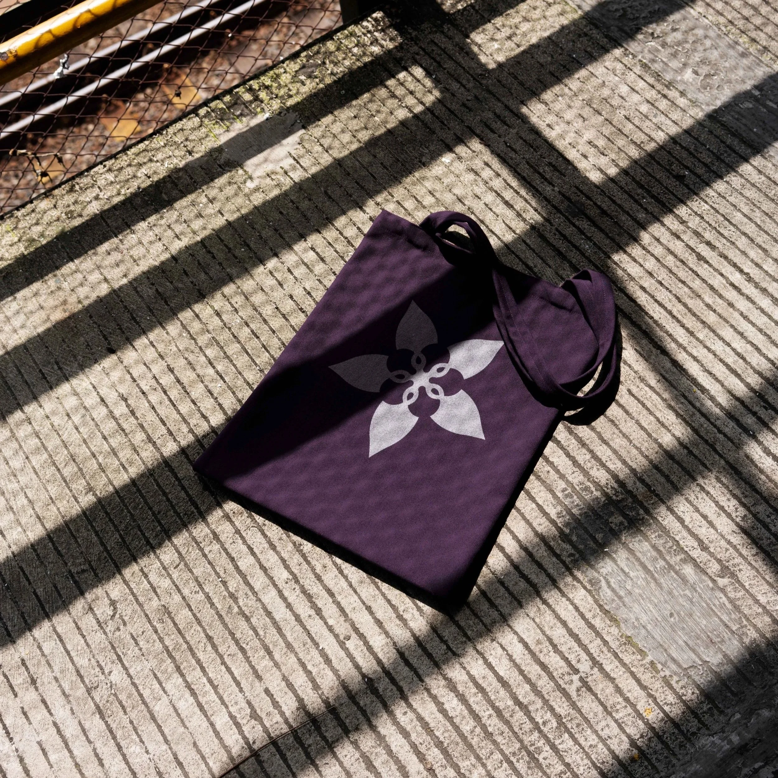
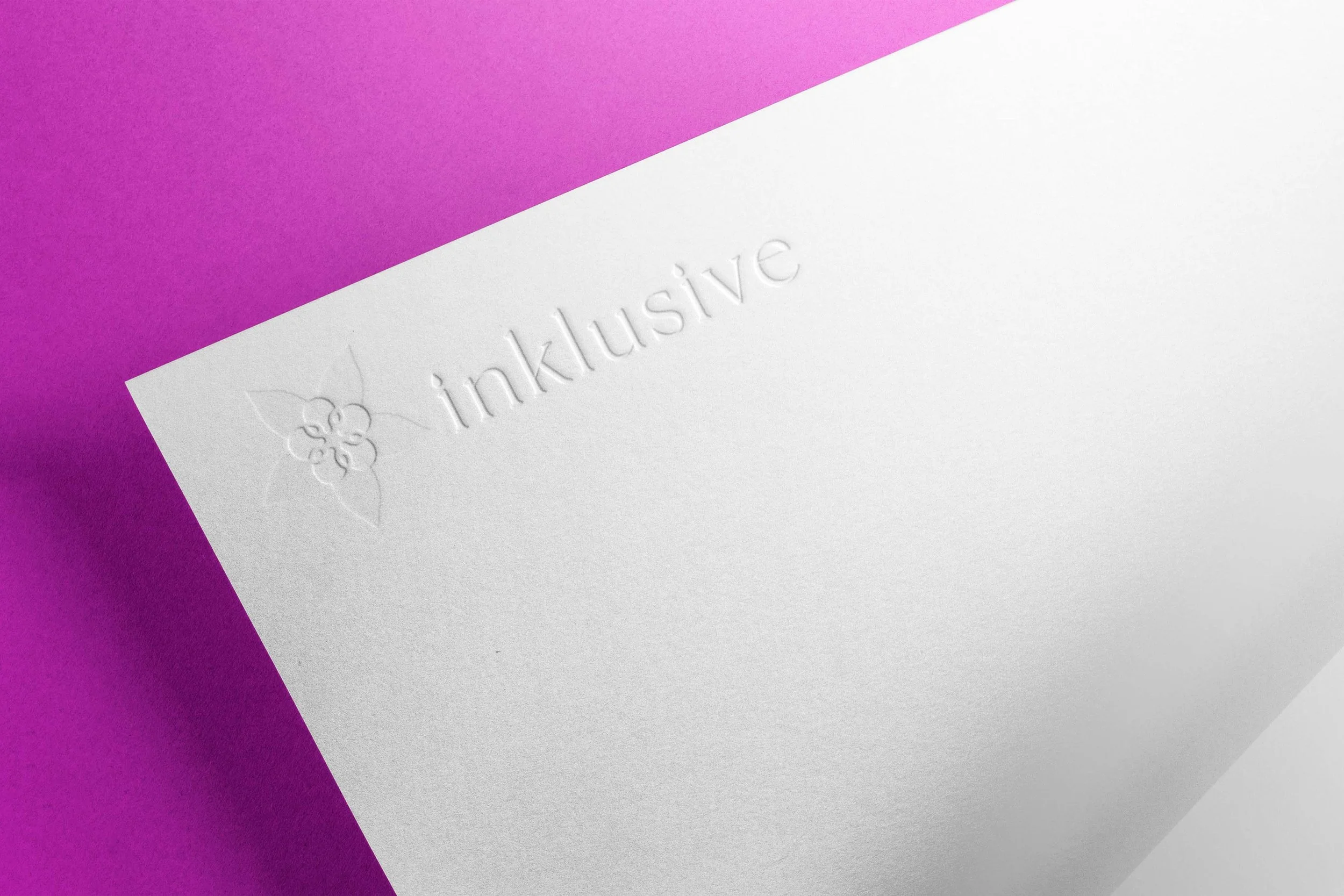
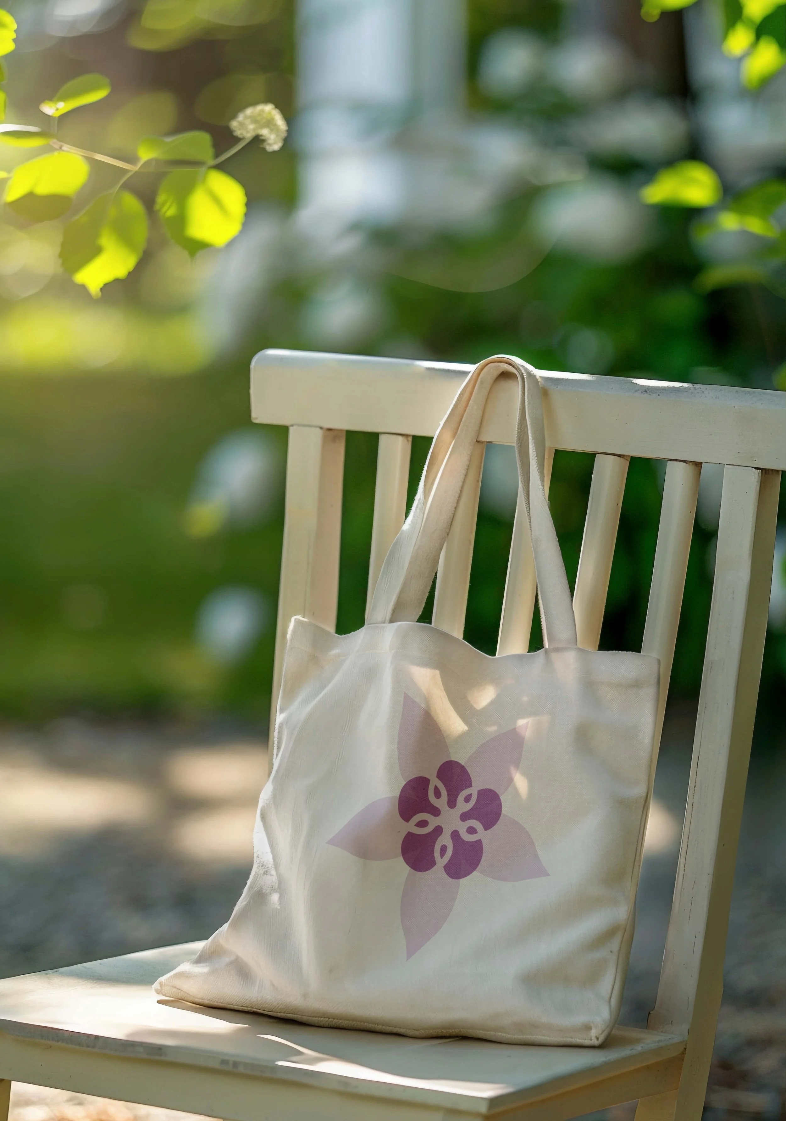
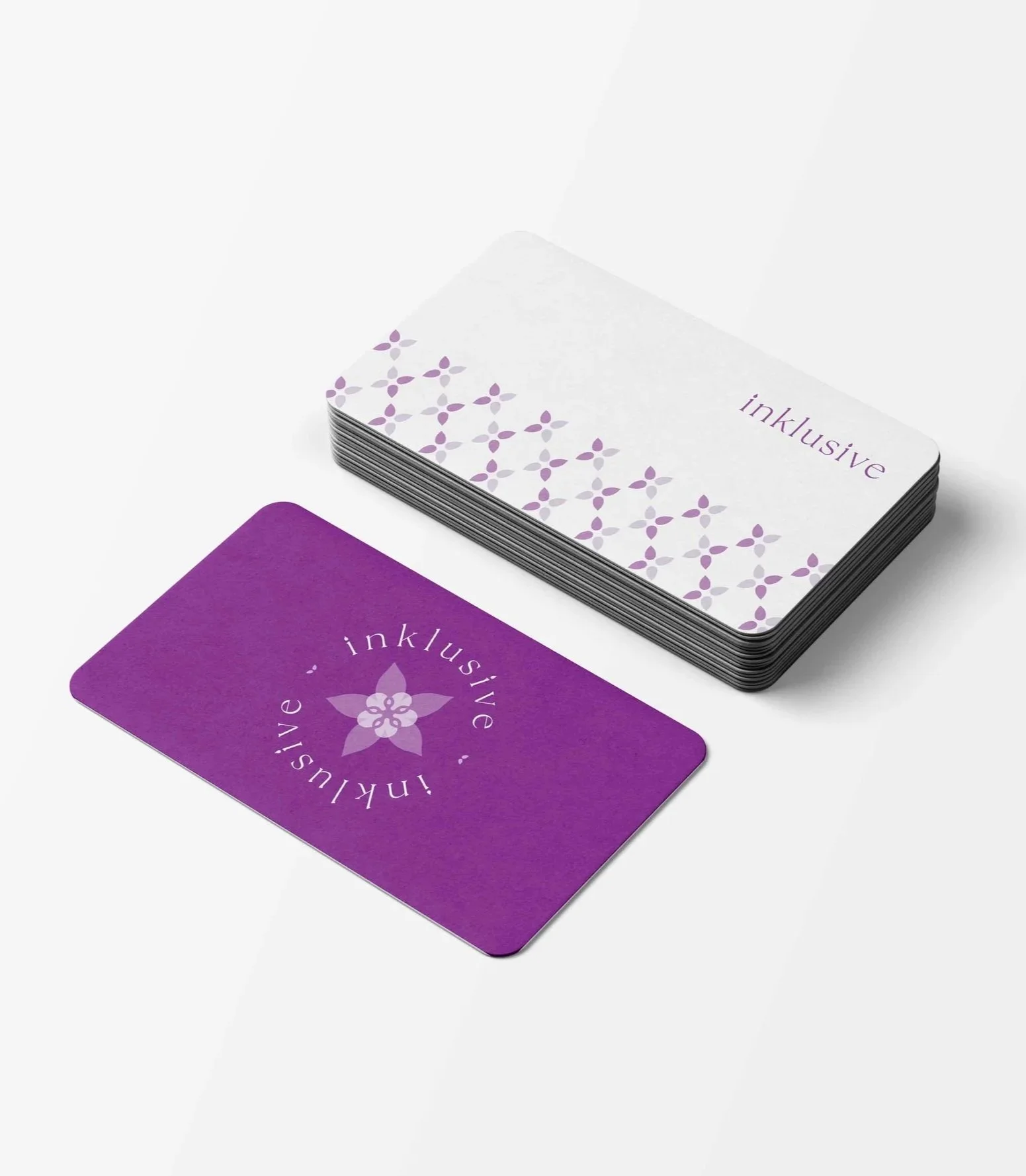
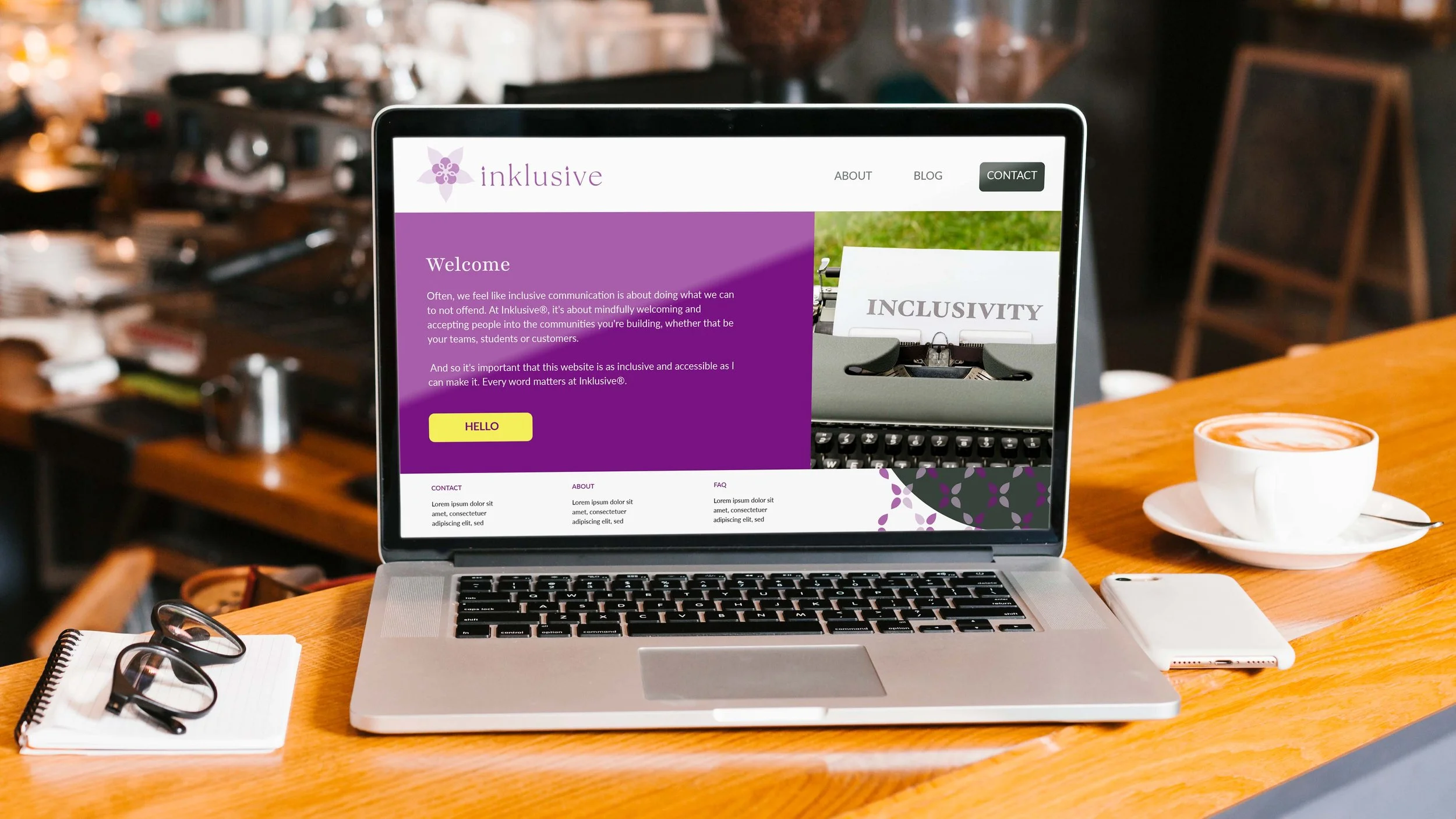
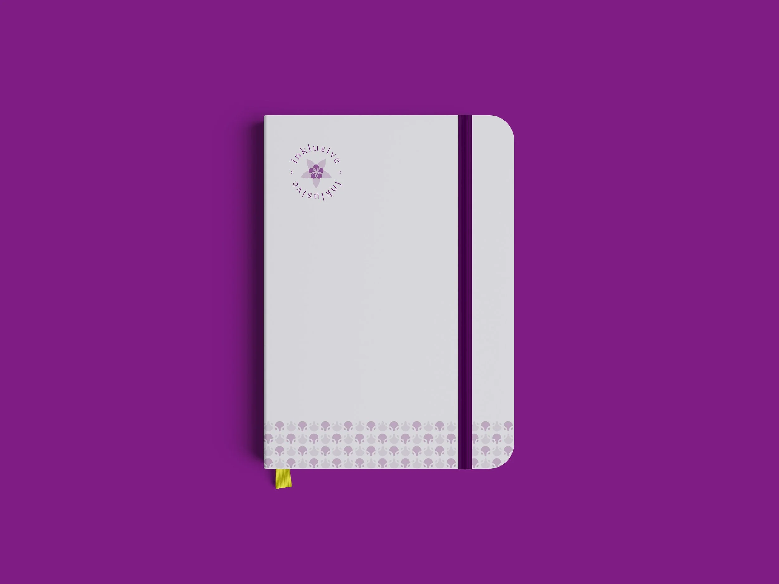
Using the Columbine flower as our anchor (a flower that means a lot to the client and is often said to represent aspiration, risk-taking, good fortune and peace) we married geometric shapes, loops and owls to establish the new logo mark.
The 3 main design features for the logo mark were:
Geometric Shapes: 5 shapes fitting together to make a flower/star shape.
Loops: Circles representing community looping together to create more shapes and “connections”.
Humanise: The inner shapes resemble faces - human and owl-like (a link to education).
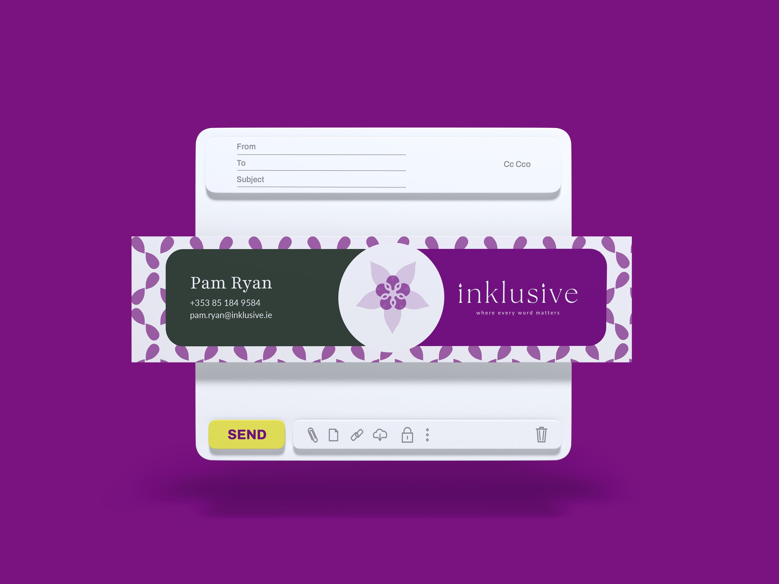
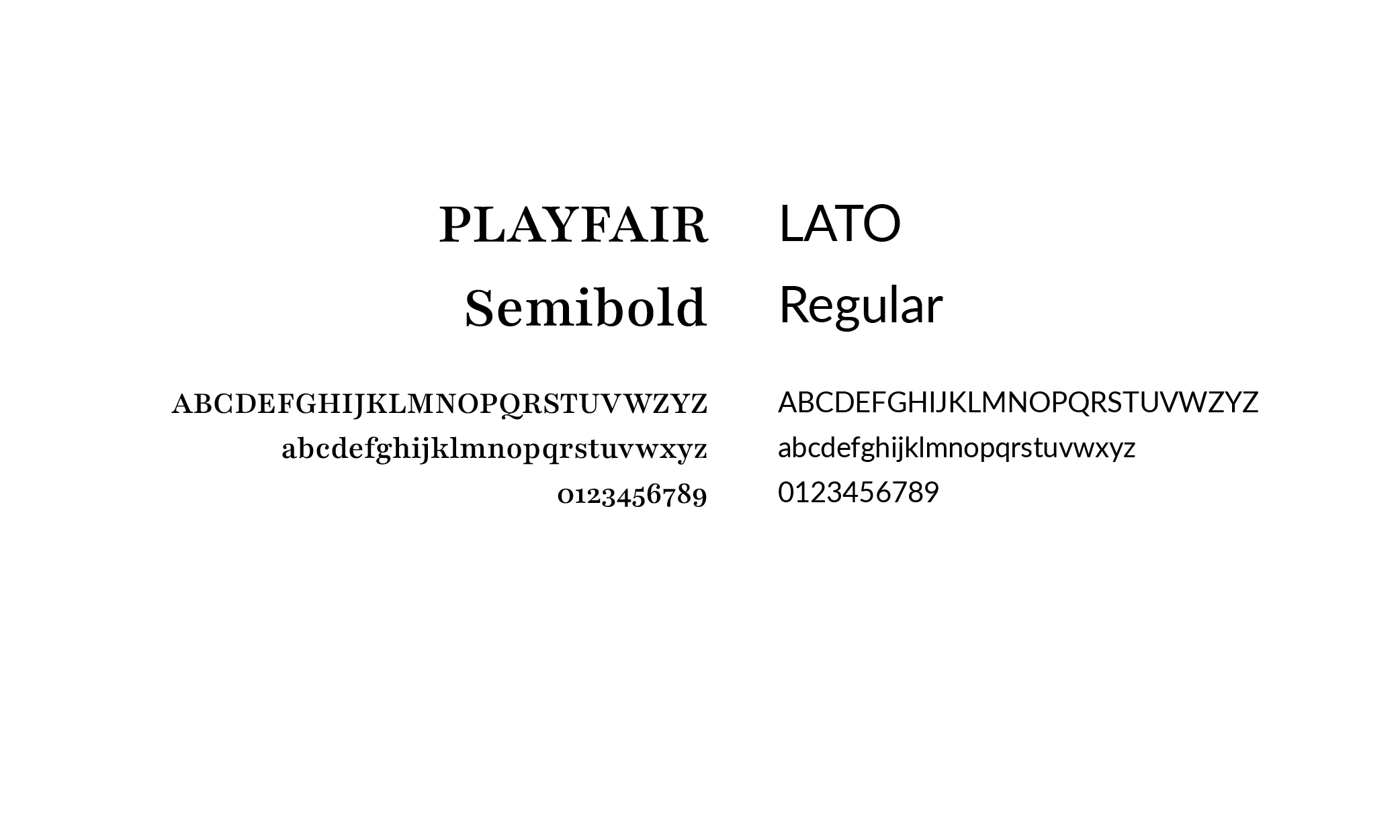
The word mark was treated with the same level of care and attention utilising smooth curves that provide a luxurious yet friendly feeling, high contrast line weights to assist with readability and all in lowercase as a nod to the bridge and approachability.
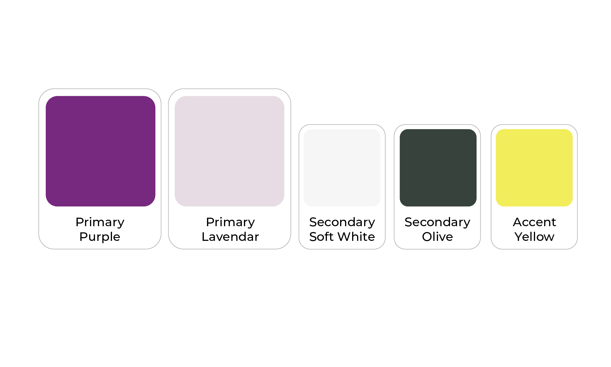
The new palette is primarily a warm purple containing a touch of magenta. It has a bold and vibrant appearance, evoking a sense of creativity, luxury, and sophistication. The purple is paired with an eye catching yellow, bringing a complimentary contrast to the warm purple. And in keeping with the theme and importance of inclusion – the palette is friendly for those with colour blindness.
WHAT THE CLIENT SAID
“Working with Lorraine was incredible! She was so attentive to the things that were important to me, like accessibility, and the end result isn't just accessible and inclusive but truly beautiful. And the process was efficient and super fun!
I'd highly recommend Luuuby Creative and working with Lorraine to anyone wanting to work on a visual identity that truly captures the essence of their brand.”
If your logo and brand identity no longer aligns with your business values – we can help!
We create branding solutions and provide support to help your business overcome visuals that don’t reflect your brand and may be hindering its growth.
We will help you achieve unique branding that emotionally connects both inside and outside your organisation, ensuring long-term success through personalised and collaborative specialist support.
We promise to provide you with the visual tools to grow your brand with confidence.